Hookmark Version 6.0 public BETA 2 (5751; Integration v. 286) is now available. See that link for detailed release notes.
This is the second beta update.
If you are using macOS Sonoma (in beta) with Hookmark, it’s highly recommended to use this latest beta, per our release notes.
One user is experiencing occasional crashes on invoking Hookmark’s context window. If you experience this please send the crash report to Microsoft App Center . If you see a pattern, please let us know.
Executive Summary of Hookmark 6
Hookmark now contains a Bookmarks window where you can peruse all your bookmarks. Use ⌘B to access it.
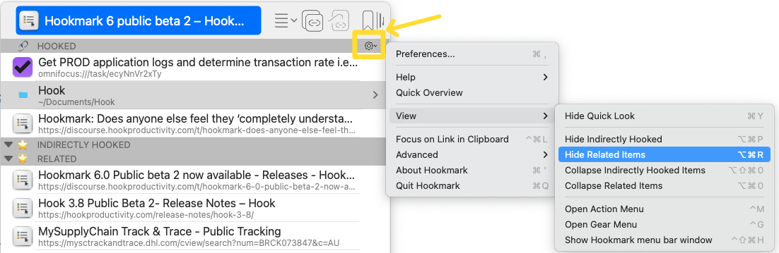
The Context window has two new sections INDIRECTLY HOOKED and RELATED ITEMS. Hide and show them via Gear menu > views.
Pinned bookmarks are now called “Flagged” bookmarks. Same keyboard shortcuts.
The FLAGGED and RECENT sections have been moved to the Bookmarks window.
You can now search for items in the context window using ⌘F. (that keyboard shortcut will change to ⌥⌘F).
You can now use Hookmark in more than one macOS account at the same time.
How do I report feedback for a Hookmark beta in general? I’ll pop it here for now.
Library Window Page Column Sorts should apply to the Dataset
Library Window does not behave as expected with regards to sorting and paging. When viewing 4,000+ bookmarks, it pages them 50 at a time (OK with this, but an adjustable page size would be better). When sorting Library Window by any column header (number of bookmarks, Title, Address, Last Accessed), it only sorts the current page by that column, not the entire dataset (not OK with this). I would expect that the entire dataset is sorted, so that (for instance), all of the most recent items appear at the top when sorting by Last Accessed. Each page of data is sorted, but that doesn’t make sense when paging through the results. There appears to be some default sort order for the dataset that cannot be controlled by the user.
More beta feedback. It was not obvious where to switch these views on. From the comment above, I was left wondering “what Gear menu”? It is quite small, but I found it! Now I will test out these features.
in the particular release topic is great. Hookmark 6 public beta 3 is now available and there is a topic for it
figuring out where/how to place this icon has been pretty hard for us. it’s changed several times over the years, but I think this is going to be its home for a while (having said that, it’s also available from the menu bar window and the Bookmarks window).
The title bar is mainly for contextual actions, whereas the gear button is general. (Exception is the Bookmarks window button).
It’s small because (a) the pane in which it is now placed is small; (b) the command there are secondary. We don’t want to distract new users from the main commands which are contextual. The Action ☰* button is where the main action is.
Some further observations. Today I discovered Quick Look, I wasn’t even aware it existed until I had a look through the Gear menu! Purely from a discovery point of view, I would somehow make the Gear icon more prominent. With the 2 new views switched on, there are 3 section headers, “Hooked”, “Indirectly Hooked” and “Related”, each section is like a subquery of the bookmarked item.
Placing access to additional functions on the “Hooked” section header may not make it’s purpose clear enough (not all sections are collapsible, “Hooked” is different, is has a Gear icon), I didn’t even notice the Gear icon earlier today.
I think like everything Hookmark offers, users will try it and see what sticks. I will try out the beta 3 and see how I go!
Maybe we should make the perimeter of the gear a bit darker, but then it would be different from other icons. If we draw too much attention to it, users might think that is where the action is.
BTW, We moved it from the status bar because
a) it was less likely to be noticed there;
b) it was not in a constant position, particularly since in Hookmark 6 there is a “RELATED items” section and an “INDIRECTLY HOOKED items” section. In internal tests we found that we would try to click on the gear icon and it would change positions so we’d miss it.
Perhaps in the short term, offer the keyboard shortcuts to show the new views in the release notes?
The Context window has two new sections INDIRECTLY HOOKED and RELATED ITEMS. Hide and show them via Gear menu > views (or use ⌥⌘P and ⌥⌘R respectively).
I think this will help new and old users alike to make that initial connection.
I’m closing this topic because Beta 3 has now been released:
Please feel free to continue the discussion there or elsewhere on the forum. We greatly appreciate your opinions on Hookmark. We read every comment carefully even if we can’t respond to them all.