Please keep the menu item in black and white and only colour it when there’s a pre-linked item count to display.
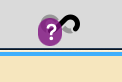
The question mark doesn’t need to be purple IMHO.
1 Like
Simple improvement idea 2:
Bring back the UI flash when the link is copied to the clipboard with copy/paste. That flash of feedback is reassuring to know that it’s worked when web.whatsapp.com current has a paste bug with firefox.
1 Like
Personally, I like the splash of color with the “question Mark” - brightens a drab monochrome menu bar.
1 Like
Well, keep it colour all the time then.
My point is about highlighting a change or not.
For me, how pretty something is, is less important than if it works well. For me, I find changes in colour that serve no purpose distracting.
If you like the colour, you need to say how that’s helping you in some way