Hook version 1.3 (2888) is now available: Minimalist UI, Link Navigation and More

We are delighted to announce major enhancements to the Hook productivity app, which you can download here or use Hook’s in-app update.

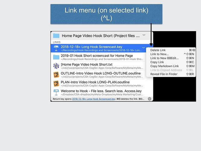
Overview of enhancements

The Hook 1.3 popup window has been significantly redesigned. It is now very compact and its operation is easy to understand.

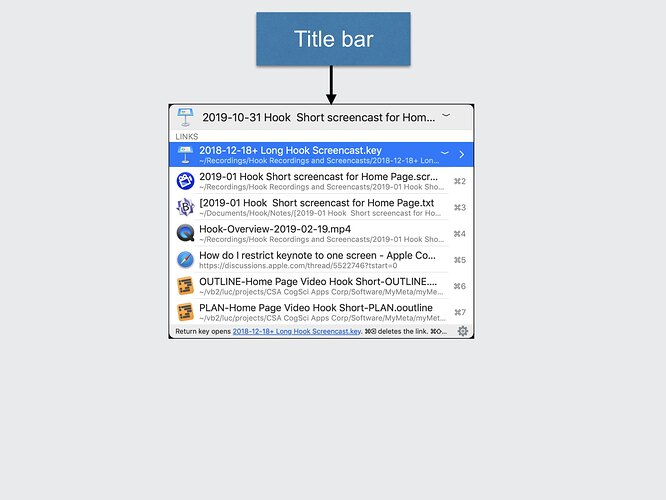
The Hook window now has three parts as depicted and described online. They are

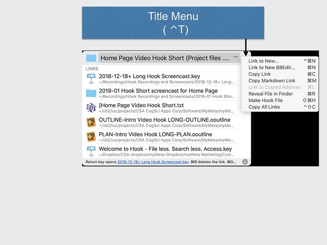
  1. the title bar, which contains a Title menu (also accessible via ⌃T) containing all the commands that operate on the current context (title item),
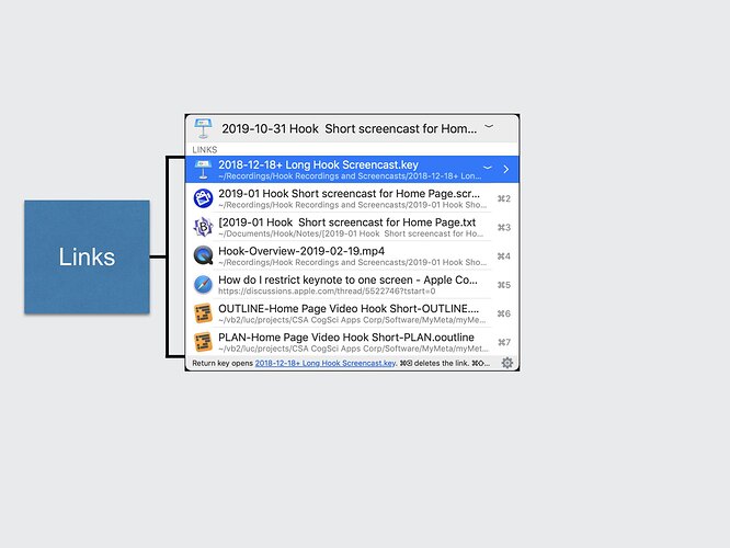
  2. the LINKS section (in the middle): each link has its own Link menu (also accessible via ⌃L), and
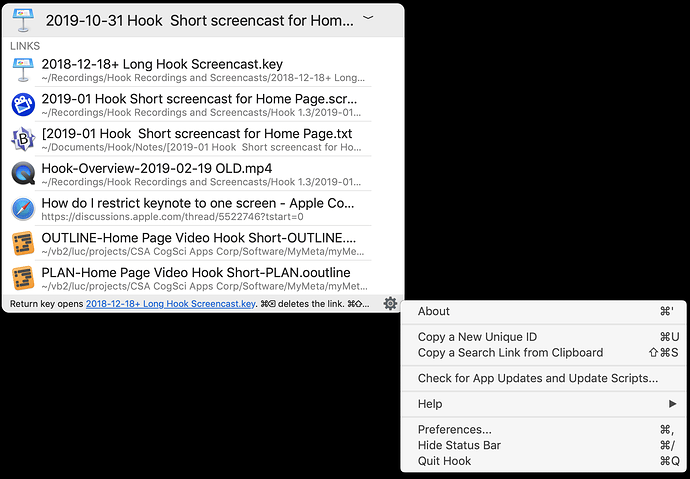
  3. the status bar at the bottom, which now contains a simpler Gear menu (also accessible via ⌃G).

Screenshots

Hook window before a resource is linked:

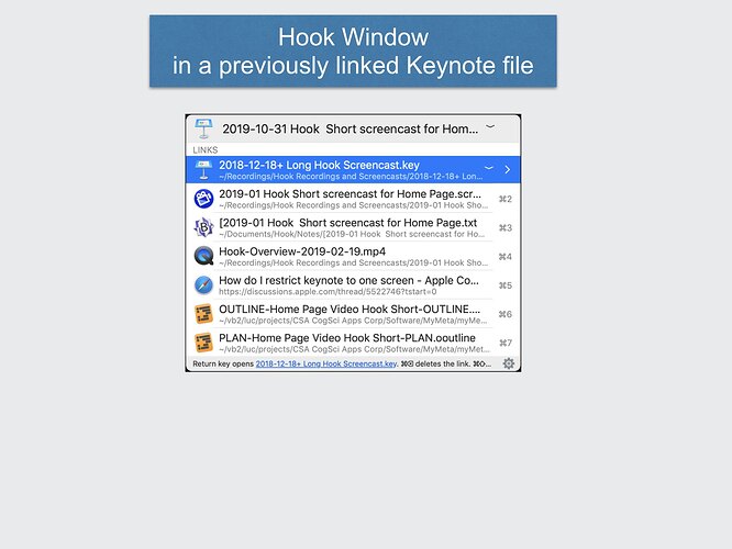
Hook window on a previously linked resource

note the title bar

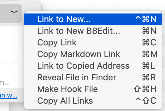
Title Menu ( ⌃T)

Notice the links section

notice you can open linked items with ⌘1, ⌘2, etc.

You can navigate into the links as described below.

Every link has a link menu

Notice that the commands are named the same as and keyboard shortcuts super similar to the Title menu.

New location of gear menu:

And we’ve taken context-sensitive commands out of the gear menu (they’re in Title menu)

More detailed list of changes

  1. All commands that operate on the Title bar item (the “context”) have been consolidated into the “Title bar () menu”. The commands include:
    a. “Link to New…” ⌃⌘N : Please note the new keyboard shortcut. This menu now replaces the Hook window’s content, which is a more compact and elegant design than prior versions of Hook.
    b. "Link to New <Default Note Taking app> ⌘N (shortcut is available, and item will be added to the menu.) (For example, “Link to New BBEdit”)
    c. “Copy Link” ⌘C
    d. Copy Markdown Link ⌘M
    e. “Link to Copied Address” ⌘L (if a URL address is in the clipboard)
    f. “Reveal File in Finder” ⌘R (if the title item is a file)
    g. “Make Hook File” ⇧⌘H
    h. “Copy All Links” ⇧⌃C (if there are any)
  2. Similarly, every link now has its own Link () menu. The Link menu is only exposed for the currently selected link (assuming there is one). Click on the , or anywhere in the label, to see the menu. Or type ⌃L. Each command in the Link menu applies to the currently selected link. The Link menu commands parallel the commands in the Title menu, but they apply to the linked item. The keyboard shortcuts are the same except they involve the SHIFT key (⇧). Thanks to the Link menu, it’s extremely easy to tell what commands operate on links.
  3. It is now possible to navigate links directly in the Hook window (without closing it)! See Navigating Links, below.
  4. The gear menu, which used to be the in the Title bar, is now at the bottom right of the Hook window (in the status-action bar). This is to make it very clear to new users that the Title menu is what they need to interact with at first. It also makes for a very clean, symmetric design.
  5. The gear menu is more compact and uniform. It no longer contains commands that apply to the Title item (the context). The gear menu now only contains global commands. The “Reveal File in Finder” and “Make Hook File” commands are now in the Title menu.
  6. “Check for updates” has been renamed “Check for App Updates and Update Scripts”.
  7. The “ACCESS LINKED ITEMS” section of Hook window is now named “LINKS”.
  8. There’s no longer a “CREATE AND LINK” section. All those commands have been moved to the Title menu, making it clear that they pertain to the Title item.

Navigating Links

It is now possible to navigate the network of Hook links.

  1. Simply type the right-arrow key or click the > button situated on any link and you will see the links that it has. You can repeat this recursively on any link that you’ve “entered”.
  2. Type the back-arrow key to go backwards, or click the < button at the top left of the Title bar.

Because Hook links are bidirectional, every link has links. So you can enter any link, even links whose targets only have one link (the link back to the current item).

How it works

When you “navigate into a link” ( a.k.a. “entering” a link),

  1. the Title bar of the Hook window takes on the name of this link. Therefore, the Title bar menu then applies to the linked object.
  2. the LINKS section is then updated to contain all the links of the item you’ve “entered”.

You can recursively navigate into linked items. In other words, you can traverse the Hook link network without closing and re-opening Hook. Just right arrow into it.

As noted, to navigate outwards (back), you can touch the back arrow key :arrow_backward: or the back button at the top left of the Title bar.

See Navigating Links (in the online documentation)

Opening a linked item (LINKS section)

The main purpose of Hook is to keep you focused by enabling you to quickly access items related to your current focus. There are several ways to activate links.

  1. select it and type return,
  2. double-click on it,
  3. New in Hook 1.3, and by request from the Hook forum: when you hold down the ⌘ key, Hook will display the ⌘# shortcuts you can use to access links. For instance, the first link will visibly be accessible via ⌘1, the second via ⌘2, and so on. So:
  • ⌘1 opens the first linked item (if there is one)
  • ⌘2 opens the second linked item
  • ⌘3 opens the third linked item
  • ⌘9 opens the ninth linked item

Commands and keyboard shortcuts

Using keyboard shortcuts saves time, minimizes brain fatigue, and also reduces repetitive strain. Hook 1.3 offers highly enhanced keyboard shortcuts. This is clearly described in the online documentation: All Commands & Shortcuts – Hook.

Here, we’d like to emphasize:

  1. The fact that commands are consolidated in the Title menu, Links menus and Gear menu means it’s extremely easy to understand what commands are available and on what object each command operates (i.e., the title item, the selected linked item, or globally, respectively),
  2. all commands are sensibly named, keyboard shortcuts are sensibly assigned, and they are easy to memorize (should you wish),
  3. there are several new shortcuts, for example the new link navigation features have corresponding keyboard shortcuts, and
  4. Hook’s shortcuts follow macOS and emacs conventions.

So, Hook has you covered.

Bug fixes

The following 1.2.2 issues are fixed in 1.3

  • some rare crashes.
  • Fixed an issue that prevented Hook menu bar icon from linking a Bear note to another object.
  • Previously, too many characters of a link name in LINKED ITEMS section were displayed
  • Fixed apparent link asymmetry for URLs containing an ampersand .
  • FIXED error in Preferences > Scripts > Address tab regarding file:\[path to the file]

Updated Integration scripts

Gratitude

Thank you to everyone who contributed on Hook Forum or other channels.

2 Likes

Is the screenshot here an erroneous repeat of the previous image?

1 Like

thanks, Steve! I’ve now fixed it.

Looks interesting, but also very confusing new interface. Difficult to figure out how to work it, without reading through and testing the release notes. Main problem is the interface depends on shortcuts that happen to interfer with several other apps I use more frequently. Since I cannot change Hooks shortcuts (other than the one to invoke Hook), I’ll either have to reconfigure the other apps or just use Hook manually with the mouse. Not an attractive prospect. I really admire all the work that goes into Hook, especially these new features.

1 Like

Thanks for the feedback , and kind words about the effort we put into this app.

I’m sorry to hear that the shortcuts conflict with yours. Hook shortcuts can be changed via System Preferences, like any other app. It’s in the forum, but I’ll do a specific help page on it. Here’s a page from OS X daily: How to Create Custom Keyboard Shortcuts in Mac OS.

The navigation features implement requests we’ve received to enable users to navigate the Hook link network. Those requests came in many forms (some want a graphical network map, which this version doesn’t provide). I don’t think anyone spelled out specifically a way to do it like the one we chose, which is similar to launchers and iOS apps. It will also allow us to add new features that work consistently. Still, I expect Hook to support other ways of navigating the network too.

I’m intrigued to know which apps. Are they shortcuts that came as default or did you choose them?

Control-T is a system-wide shortcut for swapping the position of two characters. I use it a lot as it is one of my “favourite” typing errors. See: https://support.apple.com/en-us/HT201236. Control-T is also used by the new version of DEVONthink in one of its menus. There was a certain amount of irritated debate about using Control-? shortcuts on their forum because of the clashes with other uses. Control-L is also a system-wide shortcut (in any document, perhaps I should say).

But how does that interfere with Hook, as when the Hook window is invoked no text is being edited?

1 Like

Sorry, I was under the impression that Control-T was invoking the window, but I see that it is not. However, having tried it I am wondering why Control-T is used for opening the sub-menu. Alfred uses Right Arrow, which seems a bit easier to me. But I use Alfred a lot, and have used Hook very little. Maybe it is habit.

1 Like

Hook now has three main parts and menus:

There are screenshots at the top of this topic..

We tried to make “onboarding” as easy as possible, so the menus are available via meaningfully and consistently named shortcuts:

  1. ^T: Title menu (operates on the title bar item, the “context”),
  2. ^L: Link menu (operates on currently selected link), and
  3. ^G: Gear menu

there are many other keyboard shortcuts (see All Commands & Shortcuts – Hook, a web page that is accessible via ⌥⌘K (or via Gear > Help menu).

In particular, you can also use arrow keys within the navigation history. Here again, we used a consistent scheme that is aligned with related apps (e.g., Safari; and emacs bindings).

Hi!

I only recently bought Hook Pro and I can easily see it become an important part of my workflow.

I understand and respect the design process of a specialised product like Hook is, but still wanted to give my feedback. I think the new minimalistic interface, requiring to almost always hit both the invoking shortcut and then ^T, is slower to operate than the UI that was available in version < 1.3.

I know I’m finding it more confusing, what hooked me (pun intended) was the ability to invoke the app and move up and down with the arrow for creating new links or linking to existing ones.

I’d love an option to restore the direct functionalities provided by the menu at the bottom of the window, if it is something that you can see of value for other users too. In considering this feature request, please consider that the previous flow was probably easier to understand for new users, so it could make sense to set it as default for the first sessions, when people familiarise with the app during trial.

Thank you for your work!

Cesare
@cdf1982

One does not need to expose the Title menu to expose its commands, however. Each command has a keyboard shortcut. And the shortcuts are named as previously, and as one would expect.

3

also: All Commands & Shortcuts – Hook

A Link menu is available for the currently selected link allowing you to operate on it. Each command in the Link menu also has a keyboard shortcut.

Or have I misunderstood your issue?

Hi and thank you for your reply.

You did not misunderstand my issue, and indeed I will move to those keyboard shortcuts going forward, but I felt quicker before when linking multiple files: left hand on the Hook invoking shortcut, right on the arrows.

I will adapt, obviously, but I still do wonder if this is less discoverable for new users.

Thank you!

thanks, cdf1982.

there may be a way to enable a left-hand right-hand dance with Keyboard Maestro or some tweaks of Hook itself. Also, we intend to make Hook programmable via JavaScript.

"This is a really really backwards step in usability". The previous way of operating things were much more intuitive and faster.

Before it was easy to get your fingers on the arrow keys after invoking Hook.
It is way slower to do the ctrl-T or click the title bar - the former requires one to look at the keyboard, the latter to take your fingers off the keyboard. Both are one action longer than the previous functionality, but perhaps worse - it takes one out of the flow.

I would second the suggestion made above that the new interface is optional.

The UI is designed to optimize multiple constraints. It is also partly a response to feedback we’ve received. It is also a result of usability observations we’ve made.

The menu is there for beginners. The most frequently used commands (as in 99% of the time), are : “Copy Link” and “Link to Copied Address”, each of which has a keyboard shortcut. The former uses ⌘C which is perhaps the most frequently used keyboard shortcut on macOS, even used by Mac novices. “Link to Copied Address” is innovative. It starts with the letter L which stands for linking.

The previous UI used too much room. On small screens it was problematic. (Most people are using macbook, not large displays. And even on large displays, space is at a premium. Clutter decreases has cognitive load). It was insufficiently elegant.

The current UI is consistent with macOS trends towards minimal clutter.

The most popular related productivity apps are launchers and Spotlight. They are all similar in UI/UX, using a one line minimal UI. Hook is like them.

Also, there the product road map leverages the new UI. Many features and enhancements which we believe users will be pleasantly surprised with require a compact Hook window.

As for having an option for “classic” vs. “modern” Hook window: we considered this and debated it in house. We even considered a highly configurable UI where you could decide which commands to show in the window. I opted against it for many reasons:

It would be cumbersome for documentation (textual, visuals and screencasts), customer support, QA (almost all UI testing would need to be doubled one for each case!), software development, etc. From a software perspective, it would slow down the delivery of new features. I am certain that the vast majority of users (including future users) will prefer CogSci Apps to maintain stability of Hook and deliver surprisingly useful new functionality than to maintain these two modes.

This would even put a burden on fellow forum contributors who would need to answer questions conditionally: “if you’re using classic Hook UI, do this, if modern, do that”.

A young app like Hook should not have a “classic” UI. It really isn’t the way of Mac. (Themes, perhaps, but UI variants, no).

I sincerely appreciate the feedback, but we are definitely not going down this route.

Thanks for your rationale Luc, I do see your point of view and that it makes sense.
But I still think that it should be more like the previous version.
Hook is a great product anyhow. :slight_smile:

1 Like