Shortcut and initial behavioral issues have been mentioned already, so I would like to focus on a few UI tweaks to toss into the mix.
I’ve been wanting this window for a long time. The contextual work being done in its’ own window tied to a seperate window for non-contextual / expanded use was a great addition. It plays nice with stage manager, takes minimal space with other apps, and can come and go with a keystroke.
• Have the Title, URL, and Time be independantly collapsable and horizontally sizable.
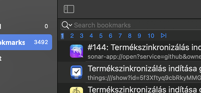
• Leaning toward compact with full readability text wrapping is too crowded for list view. The full width pop-up that shows when hovering over a long title or url is mouse only, somewhat slow, and glitchy. Perhaps the pop-up could be reconfigured to encompas the cell height and have an “active when held down key”. Select one or hold the key down while scrolling with an arrow.
• The links column should be kept next to pinned in both views and always left of the Title column as is currently in table view.
Someday:
• Add Groupings in the side bar defined by tag, project name or other suggested method. Similar to a project files folder. It’s contents could be displayed seperately in a tab that the table is already configured for. Overviews offer a huge amount of leverage to search and sort features.
• Could the list view be sorted either/or, or primary and secondary?
• Quick sort options menu similar to finder menu item.
All for now,
Thanks
